
When I mix patterns in my home and even my outfits, I think about it in the way I build fabric collections. I'm a maximalist, but as I always say, I do "Curated Maximalism™". What I mean by that is I mix and match with intention. It's not color and pattern for the sake of color and pattern. In a fabric collection, there are certain elements that have to be part of a collection, a certain mix. The key is contrast.
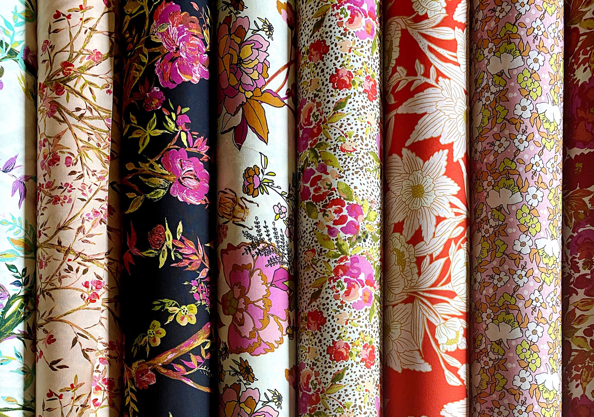
But let's talk about it in the context of fabric design because I think that makes the most sense. And it give you a broad idea of the kind of patterns you might think of using in your home. I usually start with a focal fabric, such as a large floral. It can be a tightly packed floral or one with a bit of negative space. It's great to have both, in varying scales.
I almost always add a ditsy print which is a tiny floral that is usually tossed, meaning the motif goes in all directions rather than just one or two.
The next element I use is a geometric or a stripe. Again, in varying scales. I also often add some sort of novelty print, like something with an animal or bird.

Clearly you understand from all of this what the contrast is... it's scale and type of pattern? But what is the "coordination" part of this equation? It's color. You'll want to choose one to three colors that run through your pattern mix for your home. Many more than that in a home, and it will start to look unintentional. And what you want in a mix is intentionality. Of course, your fabrics with likely have an array of colors, but you want about three that are the main colors.
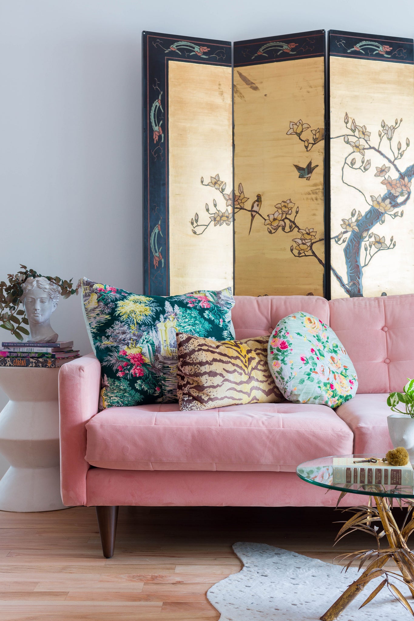
Notice above this concept translated to a room. Solo snakes on white are featured with a geometric print on the chairs. The colors coordinate.
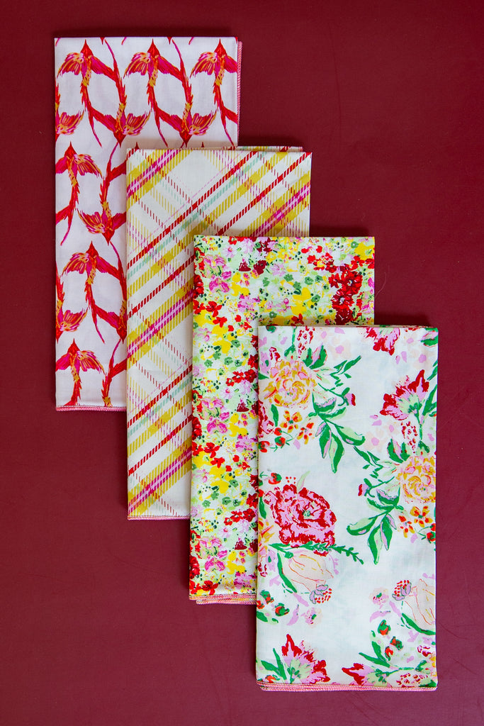
Below is a napkin set that also illustrates this notion. These are all from my Charlotte fabric collection. Pink and yellow run through all of the napkins, but notice the varying scale of the florals, the addition of a plaid, and then the bird print. All different kinds of prints in differing scales and with common colors. These would work wonderfully as pillows and other decor in your home.
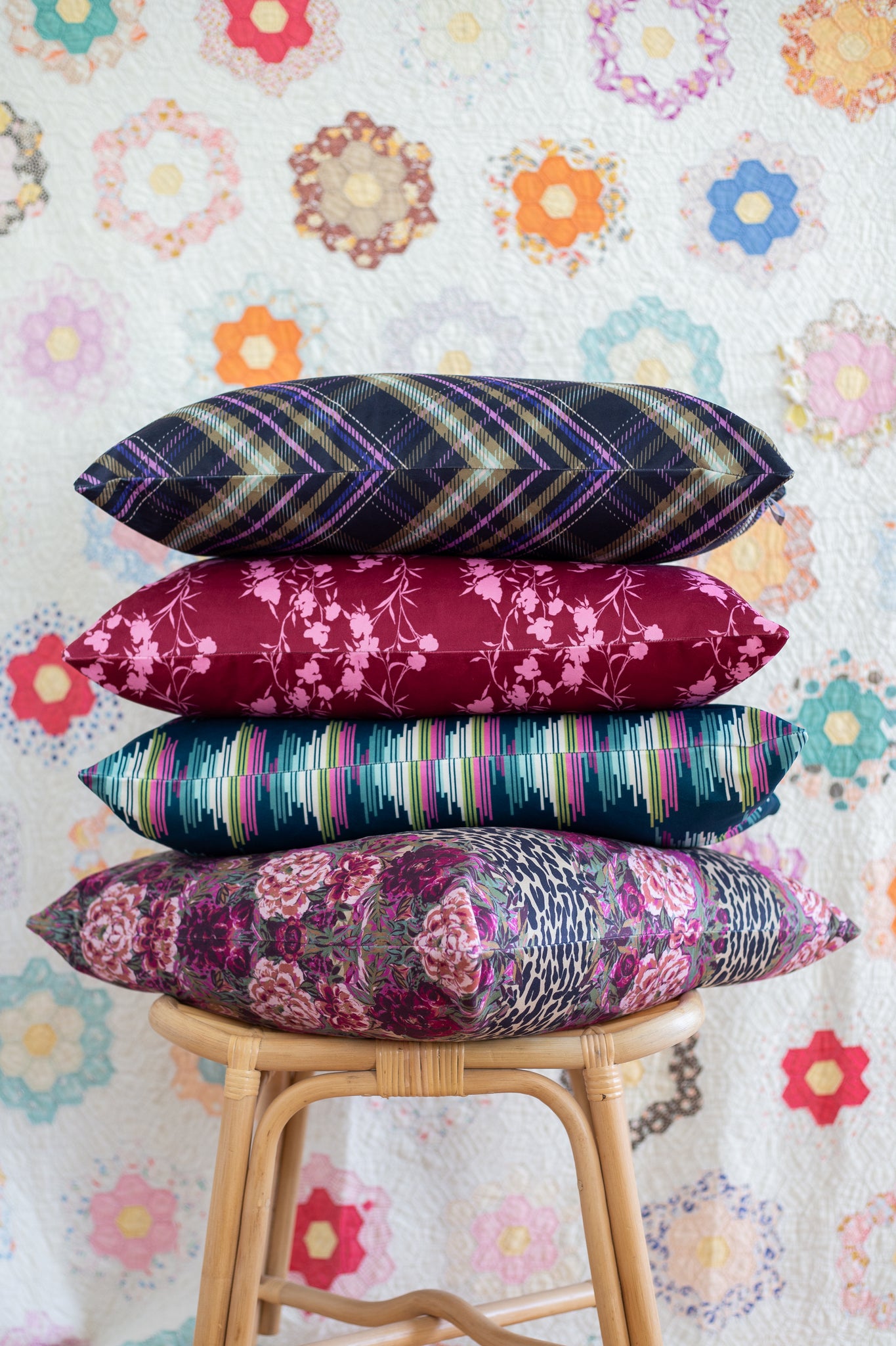
I also love this mix of pillows... scale varied, types of patterns, varied, but common colors. This pillow mix can be found here.
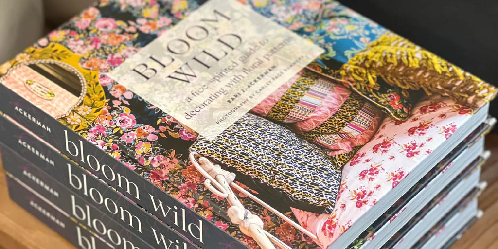
I hope this helps you the next time you go to mix and match patterns in your home or even your wardrobe! You can find tons more information in my book, Bloom Wild.
Connie
I love the Grandmothers Garden Quilt in the background of that photo. I have an identical one my Great grandmother started, my grandmother pieced and my mother quilted. Such a treasure.
Love your fabric lines too! This I a wonderful too to help some of us that can only coordinate with help.
Connie
I love the Grandmothers Garden Quilt in the background of that photo. I have an identical one my Great grandmother started, my grandmother pieced and my mother quilted. Such a treasure.
Love your fabric lines too! This I a wonderful too to help some of us that can only coordinate with help.